I’m not going to dive into forecasting evaluation here. I’m going to highlight a simple technique to consider when you’re struggling with metric choice.
The Problem
You work at a company that wants to forecast demand with historical sales data. Your team is going back and forth on what the perfect evaluation metric is. The goal is to use the evaluation metric to decide which forecast to use.
The team’s a bit hung up, some feel strongly RMSE is the right choice, while others want to use MAPE. It turns out there can often be easy ways to choose a metric with simulation.
We’ll focus on the question, “if we have a perfect forecast, what would our error metrics look like?” and we’ll use it to inform metric choice.
Simulating a fake sales time series
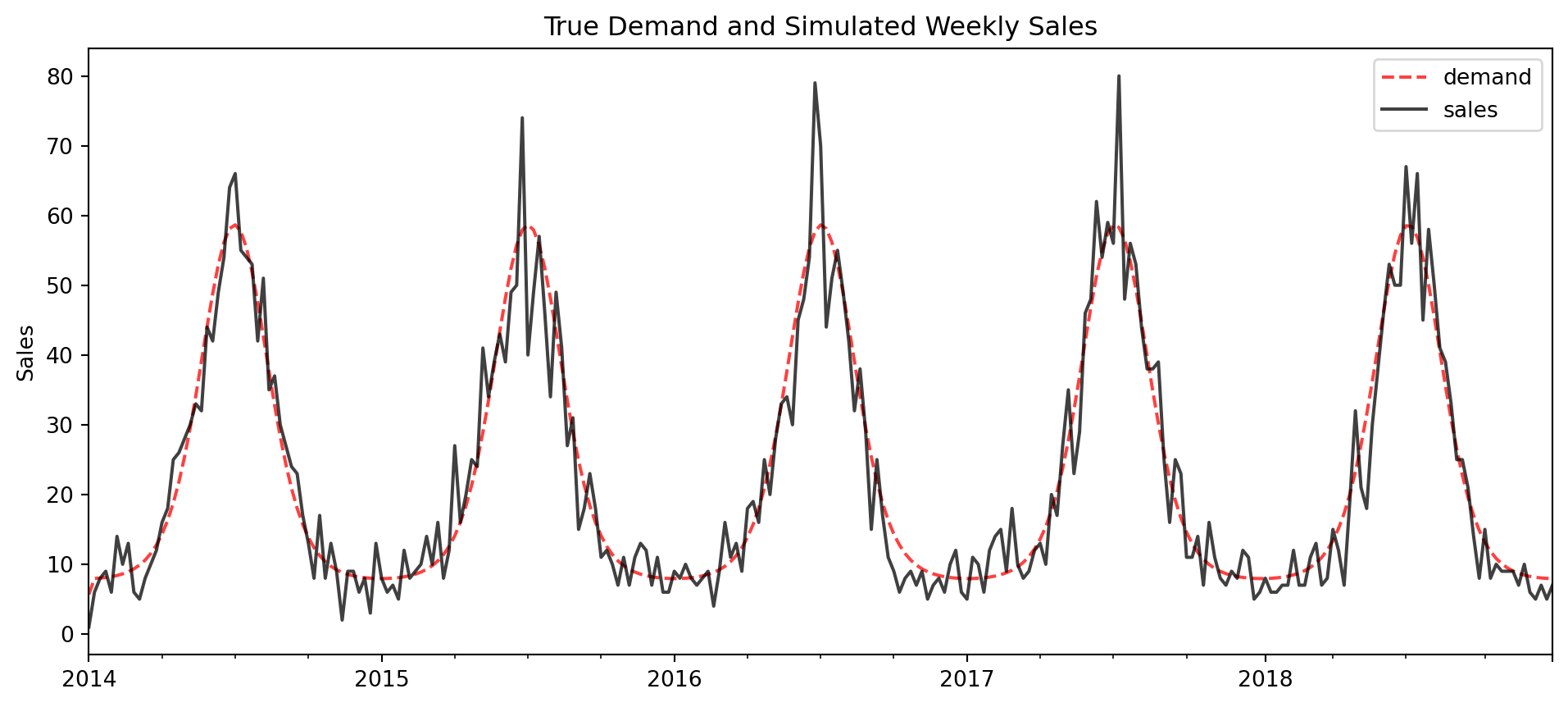
We’re going to simulate data where we know the real demand, and we add realistic amount of noise to it that resembles our actual dataset. In our case we assume the real dataset is poisson distributed, so we make our simulation have the same level of noise
The plot below shows the true underlying demand overlayed with daily sales
Code
import numpy as npimport matplotlib.pyplot as pltimport pandas as pdpd.options.display.float_format ='{:.2f}'.formatnp.random.seed(1)# Parametersyears =5period =365t = np.arange(0, years * period) # We add a phase shift to make sure the first peak happens at day 182seasonality = np.cos(2* np.pi * (t -182) / period) mu =1+ np.exp( 2*seasonality )y = np.random.poisson(mu)df = pd.DataFrame({"demand":mu, "sales":y}, index=pd.date_range("2014-01-01", periods=len(t)))# resample to weekly leveldfW = df.resample("W").sum()# Plottingfig, ax = plt.subplots(figsize=(12,5))dfW[['demand']].plot(ls='--', color='r', alpha=0.75, ax=ax, label ='True Demand')dfW[['sales']].plot(color='k', alpha=0.75, ax=ax, label='Sales')ax.set(title='True Demand and Simulated Weekly Sales', ylabel='Sales')plt.show()
What we’re doing is really simple - we know we have a perfect forecast (its the true underlying demand), so ideally a good choice of metric should look reasonable here.
In-sample forecast evaluation
In-sample forecast evaluation will be used for simplicity since its a simulation anyways, but with real data its important to use n-step-ahead evaluation or time series cross validation.
Code
from sklearn.metrics import ( mean_absolute_percentage_error as mape, mean_absolute_error as mae, root_mean_squared_error as rmse)args = (dfW.sales.values, dfW.demand.values,)pd.DataFrame( [mape(*args), mae(*args), rmse(*args) ], columns=['metric'], index=['MAPE', 'MAE', 'RMSE']).round(2)
metric
MAPE
0.25
MAE
3.62
RMSE
5.04
MAE and RMSE error look fine here, but MAPE looks terrible - a perfect forecast here is off by 25% on average (weekly). Imagine telling a stakeholder that your great forecast is off by 25% on average.
Important
In general, MAPE is pretty well known to be a meh choice of metric, but its especially apparent with low count data like this example.
We also established a definition of what a good forecast is - we know a perfect forecast on data of this magnitude and noise tends to have an MAE of 3.62 sales / week. If we’re anywhere near that we know we’re doing a good job.
This process has made it clear that MAE or RMSE error are suitable choices to consider while MAPE isn’t. Theory can drive the next step: MAE minimizes the median and is very interpretable while RMSE minimizes the mean but you lose a bit of interpretability.
There are also plenty of other metrics and evaluation techniques to consider, I just chose 3 of the most simple metrics for this example.
Concluding Thoughts
This exercise was really simple: “if we had a perfect forecast, what would our error metrics look like?”
Using simulation to answer this question not only informs metric choice, but it also helps to establish a defintion of what a good forecast is.
I acknowledge there’s alot more that goes on in forecasting and decision making than just this. But in reality, alot of stakeholders (and even data team members) can get hung up on questions like this.
I had to use this exact process once to make sure my team didn’t use MAPE as an evaluation metric - telling someone that the best you can do with MAPE is a 25% error is a pretty convincing argument not to use it.